CASE STUDY / COFFEE PACKAGING DESIGN
Coffee Packaging Design for Specialty Roaster, Trading Post Coffee Roasters
Involvement
- Ideation
- Brand development
- Packaging design
Trading Post Coffee Roasters is an established, family-run brand celebrated for its planet-conscious ethos and great-tasting coffee. The team approached me to design packaging for their new Nespresso-compatible coffee pods. The aim was to create packaging that felt fresh and distinctive while staying true to their established identity, bringing the Trading Post coffee experience into a new, convenient, and retail-ready format.
The design challenge
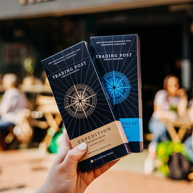
The brief was to develop packaging design for two new coffee pod variants under the Expedition range. It needed to maintain a strong link to Trading Post’s established identity while introducing a sense of freshness and excitement.
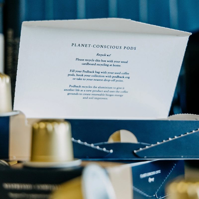
The new packaging had to feel premium, planet-conscious, and store-ready. It also needed to work across a range of retail environments, from independent health stores to luxury department stores and specialist food retailers. Additionally, the design had to appeal to both men and women aged 25 to 50 who value quality, craft, and sustainability in their coffee choices. This captures the target audience for specialty coffee packaging.
Visually, the design needed to stay aligned with Trading Post’s existing coffee brand identity while building upon it. The familiar colour palette and logo were retained, but the layout and supporting elements were developed to create a look that feels fresh and engaging. Importantly, the packaging needed to communicate the brand’s values of great-tasting coffee, independence, and environmental responsibility. As a result, the design had to elevate shelf presence within the competitive premium coffee packaging sector.
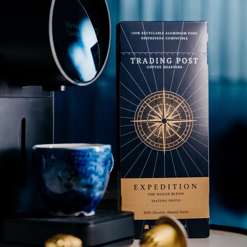
The solution
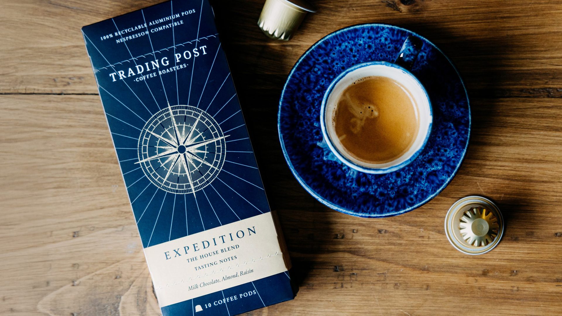
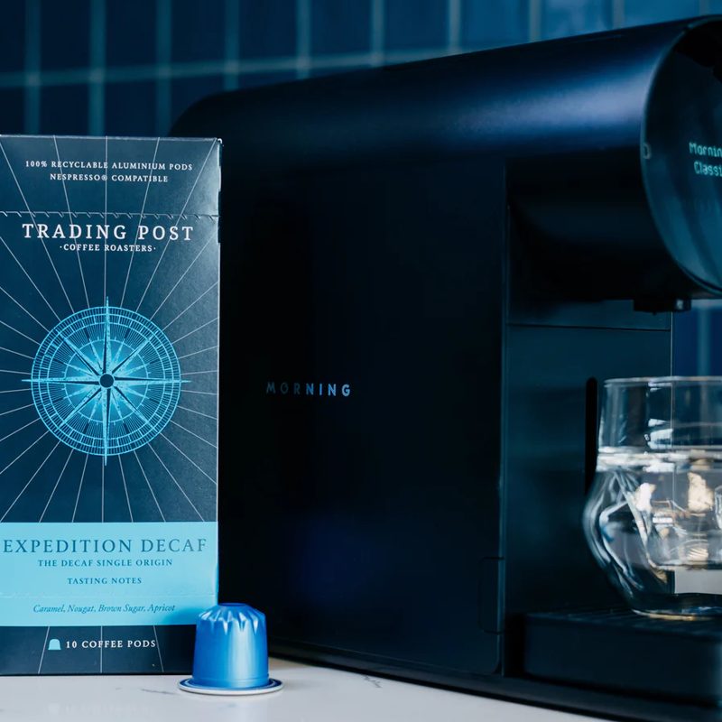
The final design builds on Trading Post’s established coffee branding, combining a premium finish with subtle storytelling elements inspired by the Expedition range name. At the centre of each pack sits a striking compass illustration. It symbolises exploration, direction, and the spirit of discovery, all key ideas behind the new range.
The navy and gold colour palette evokes sophistication and ties seamlessly into the wider coffee brand identity. Meanwhile, accent tones help distinguish the two variants. Premium details such as clean, structured typography and refined layout choices further reinforce a sense of quality and craftsmanship.
The result is a cohesive yet distinctive Coffee Packaging Design that positions the pods as a natural extension of Trading Post’s range. The design reflects a modern, sustainable, and premium aesthetic, staying true to the brand’s independent ethos and commitment to planet-conscious coffee. It was also created with flexibility in mind, allowing the range to adapt easily for future releases while remaining instantly recognisable to loyal customers and appealing to new ones.
Get in touch
Interested in finding out more or working together on a project?
I’d love to hear from you, lets talk about your project.
t: +44 (0) 7813 452100
e: hello@laracaiulodesign.co.uk