CASE STUDY / RUM LABEL DESIGN
Rum Label Design and Branding for Solar Reserve Rum
Involvement
- Brand development
- Ideation
- Label design
- Packaging design
Solar Reserve Rum Co. is a premium Caribbean rum brand that brings together craftsmanship, sustainability, and innovation. This rum label design and branding project focused on creating a refined identity that reflects the quality of the spirit while staying true to the brand’s commitment to responsible production. The aim was to build a confident, premium design that connects with modern rum drinkers who value authenticity and purpose.
The design challenge
Solar Reserve Rum Co. produces exceptional blended rums from the Caribbean, crafted with a genuine love for sustainability and fine spirit-making traditions. This rum branding and label design project focused on refining the existing logo roundel to elevate the brand’s identity. To complement this, the packaging was designed to feel more premium, reflecting the exceptional quality of the rum inside.
Founder Anthony’s vision for Solar Reserve began after discovering fine Caribbean rums back in 2012. Inspired by his love of great spirits and a genuine commitment to sustainability, he wanted to move away from the dated, overly themed look often seen in rum branding. His goal was to create something modern, refined, and environmentally conscious — a brand that celebrates premium rum without the clichés.
The target audience includes rum drinkers aged 30 to 50 who already enjoy Caribbean rum but want something a little more grown up and premium. The challenge was to create a brand that felt luxurious yet approachable, modern yet rooted in tradition, and as sustainable as possible without losing its premium edge. The goal was to deliver a complete rum label design and branding refresh that communicated authenticity, craftsmanship, and care for the planet. The new identity needed to sit confidently within the world of premium sustainable spirits while feeling fresh, elegant, and distinctive.
The solution
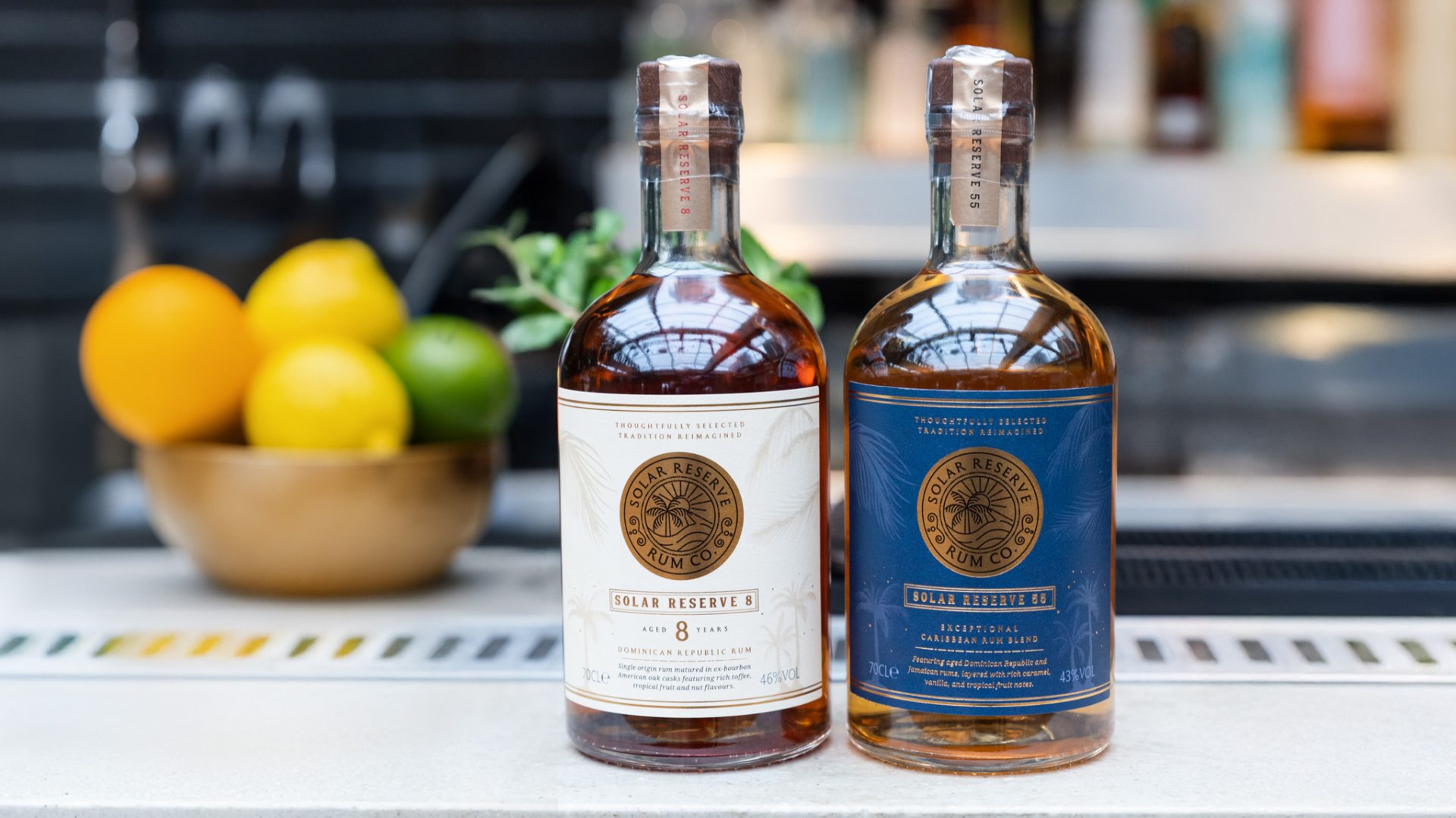
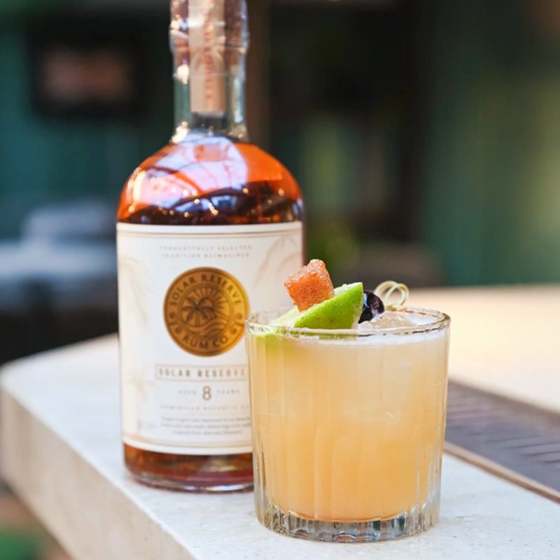
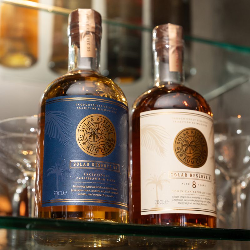
The design for Solar Reserve Rum focused on balancing refinement with warmth. The creative direction combined cues from premium spirits branding with subtle nods to Caribbean heritage and the natural energy behind the solar name. Gold foil detailing and elegant serif typography bring a sense of craftsmanship, tradition, and quality. A circular emblem featuring a palm tree and sun became the focal point of the design, symbolising the brand’s Caribbean roots and solar inspiration. This gold medallion appears across both bottles to unify the range and strengthen the premium rum branding identity.
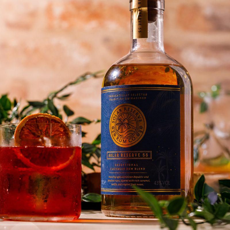
Colour was key in creating variation between SKUs. Solar Reserve 55 uses a deep navy blue to suggest richness and depth, while Solar Reserve 8 adopts a soft cream tone that feels classic and pure. Both are tied together with gold detailing that catches the light and reinforces the solar concept. Soft palm illustrations add quiet texture and a sense of place without distracting from the clean design. The bottle shape, paper seal, and thoughtful material choices all convey a sense of premium quality and sustainability.
Get in touch
Interested in finding out more or working together on a project?
I’d love to hear from you, lets talk about your project.
t: +44 (0) 7813 452100
e: hello@laracaiulodesign.co.uk